
saint jude's infirmary album cover
What we have on this page is an example of the graphic design process.
This is a timeline of the stages the cover went through.
Third stage was after the tartan kids were rejected and I was asked to do something simpler, dominated by black:
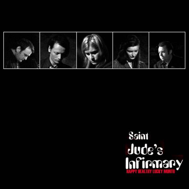
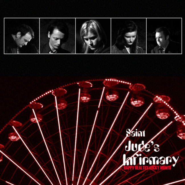
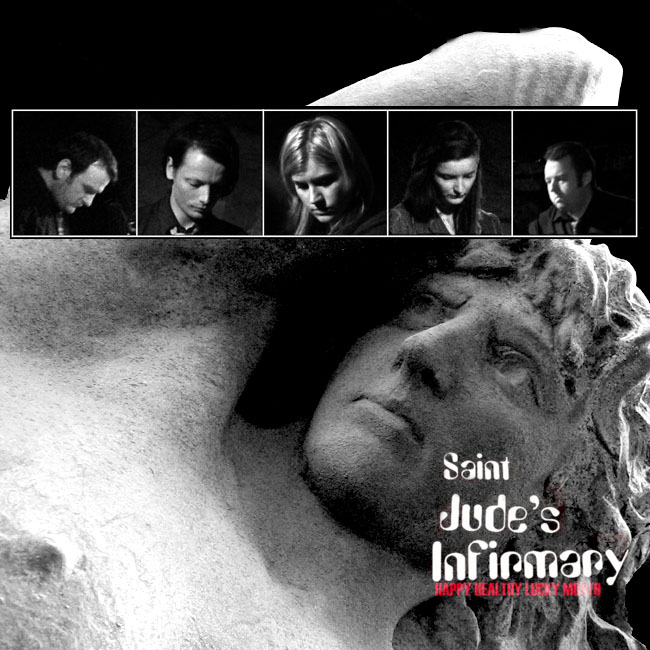
I spent a fair amount of time on the logo before I started on these covers. For the first cover I used a grid of headshots taken at a gig. This had a power of it's own. Then I remembered that the band had liked the big wheel picture at the first stage and added a different image of it below the grid. The third was influenced by the cover of Closer by Joy Division.